TUTORIAL – Digital Painting – 001:
A brief 15 minute demo that describes the beginning steps of a painting. Brushes from the video found here
http://www.shaddyconceptart.com/download
BE SURE TO SET VIDEO TO 720p!
For Studio Demos, Freelance or Just to say Hi, Email me at shaddysafadi@yahoo.com!
Mostrando entradas con la etiqueta Tutorial. Mostrar todas las entradas
Mostrando entradas con la etiqueta Tutorial. Mostrar todas las entradas
22 oct 2012
new You Tube videos
new You Tube videos:

Just posted a few videos last Friday in promotion of my upcoming studio workshop on October 21st. Hope to see you here. If you cannot make it, please enjoy the new videos at least.
Cheers,
Scott.


Cheers,
Scott.

kalidraws: Today I gave my students a quick presentation on...
kalidraws:
Today I gave my students a quick presentation on...:


kalidraws:
Today I gave my students a quick presentation on...:
kalidraws:
Today I gave my students a quick presentation on some of the basic considerations for composition, which I am now sharing with you! I’ve given them separate talks about color and tonal value/contrast, which are also super important compositional concerns. (I’ll be sharing those presentations too once I properly format them)
I personally love learning about different compositional techniques. It’s fun to think about the ways that the brain views & sorts images, and how we can trick it into feeling a certain way or looking at certain aspects of an image first! It’s easy to fall into compositional ruts (which I am also guilty of) because a lot of art gets by with mediocre, though serviceable, compositions. If you can generally understand what’s happening in an image then it’s generally fine. However, it’s the truly great compositions, where everything in the whole image has been considered and ‘clicks’ together, that bump up an illustration to a visual slam dunk. NC Wyeth is one of my favorite artists for this reason: his compositions are rock solid, varied based on the image’s intent, and always enhance the mood or action he is depicting.
For extra reading, some online compositional resources that I’ve found helpful or interesting include:
Creative Illustration by Andrew Loomis (download it for FREE. Such a great book all-around.)
Gurney Journey (check out the “Composition” tag, but really everything he posts is great)
The Schweitzer guide to spotting tangents
Cinemosaic (a blog by Lou Romano with some truly WONDERFUL compositions captured from various films)
Where to Put the Cow by Anita Griffin
Happy composition-ing!
10 Things...About Generating Paintings
10 Things...About Generating Paintings:

Gregory Manchess
This is about the stages of idea generation that I’ve observed for decades in my own work. I didn’t know this was what was going on for a long, long time, but I kept watching it, studying the nuances. Then, as I read more about what other creatives such as writers, musicians, theorists, mathematicians, scientists, and engineers were experiencing, I saw patterns emerge from my own struggles.
The sequence:
Genesis
The beginning stages of an idea. All ideas are based on previous ideas. Thoughts are tagged to each other in a sequence. Sort of a chicken-or-egg endeavor, but basically ideas form from the idea before it. Thoughts are rarely isolated. One thought leads to another.
Sometimes, we feel lucky. Something pops into mind immediately.
I had a call from a magazine once and within ten seconds of hearing the story, I had the right image. But it was an image I had in the back of my mind.....for ten years.

Research
Looking for clues. Taking your passion and pushing it. Usually at this stage we encounter the same thought pattern, working with the first thing that comes to mind. But the first thing is generally not the best, unless you can simplify it, or it came from an idea you had long ago and your brain is still hashing it out.
Just like that idea I had simmering for ten years.

Passion builds
Piecing it together. Building on the idea. Things are starting to gel. Disparate images are merging, but it’s not there yet. Reject the obvious. Good time to smash conflicting ideas together: concrete cellophane, twisted smoothness, barbarous laughter, silent euphoria, etc. This stimulates the brain to get curious and try things. That’s where we find answers...
At this stage: concentrate!

Failure
But still nothing works. Nothing looks right. Nothing makes sense yet. The image is fuzzy, or worse, it’s boring. You try and try, but still nothing. Failure after failure. You force the issue. It doesn’t come together in your head or on paper. Frustration sets in. Avoidance. Depression.
Keep going....it’s part of the process. In fact, you MUST push through this stage or nothing gets finished.

Stall
But you can’t keep going. Ya got nothin’. You’re losing interest. So you stall. Your mind flat-lines.
First thing: go for a walk. Several studies now on the effect of the right-left movement of your legs on your brain's right-left hemispheres. Better yet: sleep on it. Don’t look for it. Let it simmer. Your head is still working in the background. Relax. Distract. Play. Do something completely different, off the wall. Meet friends, have fun. It needs some time. Daydream!
Rebirth
When you least expect it, and I mean least: a spark....a thought appears. While you’re engaged with something else, a simple, tiny connection occurs. The embers reignite. They start to smoke.
Wait a minute--what was that? Write it down. Do a sketch. It’s coming. Hold it---insight is occurring....something you hadn’t thought of, or something you did think of but just not quite like this, not quite this way. Curiosity returns. The brain lights up in areas across the hemispheres, pulling info from every sector. Smells, feelings, sounds. The piston chemistry starts firing. One thought leads quickly to another, faster this time, faster than you can hold on to. Where’s that pencil?
Usually known as the ‘Aha Moment’ of insight, it sometimes occurs fully formed--but only after much concentration, then relaxation.

Recommit
You see something, know something now. You have to get it down! Drawing, drawing....wait--not like that.....like this!
Breakthroughs occur here. Your brain recommits to the challenge. When it does, success is not far away.


This is about the stages of idea generation that I’ve observed for decades in my own work. I didn’t know this was what was going on for a long, long time, but I kept watching it, studying the nuances. Then, as I read more about what other creatives such as writers, musicians, theorists, mathematicians, scientists, and engineers were experiencing, I saw patterns emerge from my own struggles.
The sequence:
Genesis
The beginning stages of an idea. All ideas are based on previous ideas. Thoughts are tagged to each other in a sequence. Sort of a chicken-or-egg endeavor, but basically ideas form from the idea before it. Thoughts are rarely isolated. One thought leads to another.
Sometimes, we feel lucky. Something pops into mind immediately.
I had a call from a magazine once and within ten seconds of hearing the story, I had the right image. But it was an image I had in the back of my mind.....for ten years.

Research
Looking for clues. Taking your passion and pushing it. Usually at this stage we encounter the same thought pattern, working with the first thing that comes to mind. But the first thing is generally not the best, unless you can simplify it, or it came from an idea you had long ago and your brain is still hashing it out.
Just like that idea I had simmering for ten years.

Passion builds
Piecing it together. Building on the idea. Things are starting to gel. Disparate images are merging, but it’s not there yet. Reject the obvious. Good time to smash conflicting ideas together: concrete cellophane, twisted smoothness, barbarous laughter, silent euphoria, etc. This stimulates the brain to get curious and try things. That’s where we find answers...
At this stage: concentrate!

Failure
But still nothing works. Nothing looks right. Nothing makes sense yet. The image is fuzzy, or worse, it’s boring. You try and try, but still nothing. Failure after failure. You force the issue. It doesn’t come together in your head or on paper. Frustration sets in. Avoidance. Depression.
Keep going....it’s part of the process. In fact, you MUST push through this stage or nothing gets finished.

Stall
But you can’t keep going. Ya got nothin’. You’re losing interest. So you stall. Your mind flat-lines.
First thing: go for a walk. Several studies now on the effect of the right-left movement of your legs on your brain's right-left hemispheres. Better yet: sleep on it. Don’t look for it. Let it simmer. Your head is still working in the background. Relax. Distract. Play. Do something completely different, off the wall. Meet friends, have fun. It needs some time. Daydream!
Rebirth
When you least expect it, and I mean least: a spark....a thought appears. While you’re engaged with something else, a simple, tiny connection occurs. The embers reignite. They start to smoke.
Wait a minute--what was that? Write it down. Do a sketch. It’s coming. Hold it---insight is occurring....something you hadn’t thought of, or something you did think of but just not quite like this, not quite this way. Curiosity returns. The brain lights up in areas across the hemispheres, pulling info from every sector. Smells, feelings, sounds. The piston chemistry starts firing. One thought leads quickly to another, faster this time, faster than you can hold on to. Where’s that pencil?
Usually known as the ‘Aha Moment’ of insight, it sometimes occurs fully formed--but only after much concentration, then relaxation.

Recommit
You see something, know something now. You have to get it down! Drawing, drawing....wait--not like that.....like this!
Breakthroughs occur here. Your brain recommits to the challenge. When it does, success is not far away.


Cover illustration for Kilkenny, by Louis L'Amour
Composition Basics: Sketching Thumbnails
Composition Basics: Sketching Thumbnails:
In this post, I'd like to demonstrate my process for sketching concepts for a client. I'm not talking about sketching with the intent of making a beautiful drawing, where line weight and texture matter. Nor am I talking about making a realistic one. I'm talking about sketching very rough concepts that quickly convey your idea to a client. In essence, these are just elaborate thumbnails.
It seems to me that a lot of students have trouble sketching thumbnails. They either don't spend enough time on them, or often times skip the phase entirely. The result is, they spend even more time repeatedly revising a painting that was flawed from the start, when a much better option was just a few scribblings away. Part of me suspects they either don't realize the importance of this phase, or avoid it because they simply do not know how to approach it.
Sketching thumbnails should be fun, and easy. There are as many approaches to doing it as there are artists. My method is just one of them, and by no means the best solution. I'm sharing an approach that works for me, in the hopes that it will demystify the process for some of you.
I used to do all of my sketching in pencil, but found that I drew too linearly when I did so, almost comicbook-like. For some styles, that's fine. But because I paint realistically, and there are no actual 'lines' in my finished works, I found it to be an ineffective method. Things that looked really good in my sketch fell flat in the final because they did not have the strong impact of a line holding it all together.
Instead, I now do all my sketching digitally. This allows me to 'paint' my sketches. Amorphous blobs of grey gradually come together to reveal forms and space. This translates a LOT easier to my painting style.
The choice to sketch digitally is personal preference due to my own habits. You may not have the same problems with pencil that I do, and may find better success drawing traditionally. That's fine. The medium here is absolutely irrelevant. It's the approach that matters.
In an earlier post, I talked about Value Structure, and how by simplifying your composition into 3 or 4 basic values helps increase legibility, and creates a more believable sense of depth. This method is not something you just implement at the end of painting. It is, in fact, how I start all of my compositions.

Let's begin by taking 4 simple values... white, near white, near black, and black. By eliminating a true midtone, I force myself to make everything in my composition either light or shadow. This makes for stronger, more striking compositions.
I am going to start with the white of the canvas, and gradually build upon that.

Let's add in some near whites. This part is very experimental, just reckless scribbling, until I find something appealing.

Now onto the near blacks. Again, this is just stream of consciousness scribbling until I stumble across something nice.

Already you can see that the sketch has depth and a strong silhouette. In just 30 seconds, and only three values, I managed to create a fairly legible composition. Let's keep going and add some blacks.

At this point, you can stop.
Seriously, that's it.
This is as detailed as your thumbnails ever need to be. After this, everything else is just embellishment. If your composition isn't working at this point, all the details in the world aren't going to make it any better. If your composition isn't good enough for you, do another.. and another... and another! You can easily bang out 20 of these in an hour, and I encourage you to do so.
Thumbnails... easy-peasy, right?
So what happens if you do like the thumbnail? Sketching always seems to be some personal form of hieroglyphs for me, and even though I may understand what's going on, someone else may not. So if I decide to submit this composition to a client, I need to refine it a bit further still.
Let's start by scribbling in some details, so people can tell what all this junk actually is.
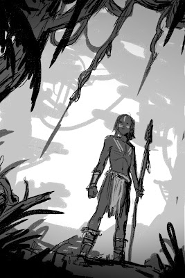
Since I started the composition with such a strong value structure, I can easily add gradients and details on top of that, without fear of losing the impact of the piece. This strong value structure will also prevail if I decide to add color to my sketch.
Remember that previous post about Temperature Structure? Well, let's implement it! The idea is no different than value structure. Let's place some warm, near warm, near cool, and cool tones on top of this sketch. The values are still doing all the work, but the temperature shift just pushes their effect even further.

Let's add a few more details, some highlights to snaz it up... and viola!

It's still pretty sloppy, but honestly this is usually about as detailed as my finished sketches get. I tend to submit 3 or 4 sketches like this for my clients to choose from. If I really want to impress them, I may go in and refine things a bit a further, but it's really not necessary. A good Art Director knows what to expect from his/her Illustrator, and should be able to envision what the finish product will look like.
So that's it.
The next time you're working on a new composition, challenge yourself to do as many rough sketches as possible, at least 20. And remember to be fearless! There is no need to refine and be precious about every little step. In the time you spend fussing with one bad thumbnail, you could have done 3 more!
I tend to think of it like panning for gold. You have to sift through a whole lot of crap before you find that one sparkling nugget that makes it all worth it!

-By Dan dos Santos
In this post, I'd like to demonstrate my process for sketching concepts for a client. I'm not talking about sketching with the intent of making a beautiful drawing, where line weight and texture matter. Nor am I talking about making a realistic one. I'm talking about sketching very rough concepts that quickly convey your idea to a client. In essence, these are just elaborate thumbnails.
It seems to me that a lot of students have trouble sketching thumbnails. They either don't spend enough time on them, or often times skip the phase entirely. The result is, they spend even more time repeatedly revising a painting that was flawed from the start, when a much better option was just a few scribblings away. Part of me suspects they either don't realize the importance of this phase, or avoid it because they simply do not know how to approach it.
Sketching thumbnails should be fun, and easy. There are as many approaches to doing it as there are artists. My method is just one of them, and by no means the best solution. I'm sharing an approach that works for me, in the hopes that it will demystify the process for some of you.
I used to do all of my sketching in pencil, but found that I drew too linearly when I did so, almost comicbook-like. For some styles, that's fine. But because I paint realistically, and there are no actual 'lines' in my finished works, I found it to be an ineffective method. Things that looked really good in my sketch fell flat in the final because they did not have the strong impact of a line holding it all together.
Instead, I now do all my sketching digitally. This allows me to 'paint' my sketches. Amorphous blobs of grey gradually come together to reveal forms and space. This translates a LOT easier to my painting style.
The choice to sketch digitally is personal preference due to my own habits. You may not have the same problems with pencil that I do, and may find better success drawing traditionally. That's fine. The medium here is absolutely irrelevant. It's the approach that matters.
In an earlier post, I talked about Value Structure, and how by simplifying your composition into 3 or 4 basic values helps increase legibility, and creates a more believable sense of depth. This method is not something you just implement at the end of painting. It is, in fact, how I start all of my compositions.

Let's begin by taking 4 simple values... white, near white, near black, and black. By eliminating a true midtone, I force myself to make everything in my composition either light or shadow. This makes for stronger, more striking compositions.
I am going to start with the white of the canvas, and gradually build upon that.

Let's add in some near whites. This part is very experimental, just reckless scribbling, until I find something appealing.

Now onto the near blacks. Again, this is just stream of consciousness scribbling until I stumble across something nice.

Already you can see that the sketch has depth and a strong silhouette. In just 30 seconds, and only three values, I managed to create a fairly legible composition. Let's keep going and add some blacks.

At this point, you can stop.
Seriously, that's it.
This is as detailed as your thumbnails ever need to be. After this, everything else is just embellishment. If your composition isn't working at this point, all the details in the world aren't going to make it any better. If your composition isn't good enough for you, do another.. and another... and another! You can easily bang out 20 of these in an hour, and I encourage you to do so.
Thumbnails... easy-peasy, right?
So what happens if you do like the thumbnail? Sketching always seems to be some personal form of hieroglyphs for me, and even though I may understand what's going on, someone else may not. So if I decide to submit this composition to a client, I need to refine it a bit further still.
Let's start by scribbling in some details, so people can tell what all this junk actually is.

Since I started the composition with such a strong value structure, I can easily add gradients and details on top of that, without fear of losing the impact of the piece. This strong value structure will also prevail if I decide to add color to my sketch.
Remember that previous post about Temperature Structure? Well, let's implement it! The idea is no different than value structure. Let's place some warm, near warm, near cool, and cool tones on top of this sketch. The values are still doing all the work, but the temperature shift just pushes their effect even further.

Let's add a few more details, some highlights to snaz it up... and viola!

It's still pretty sloppy, but honestly this is usually about as detailed as my finished sketches get. I tend to submit 3 or 4 sketches like this for my clients to choose from. If I really want to impress them, I may go in and refine things a bit a further, but it's really not necessary. A good Art Director knows what to expect from his/her Illustrator, and should be able to envision what the finish product will look like.
So that's it.
The next time you're working on a new composition, challenge yourself to do as many rough sketches as possible, at least 20. And remember to be fearless! There is no need to refine and be precious about every little step. In the time you spend fussing with one bad thumbnail, you could have done 3 more!
I tend to think of it like panning for gold. You have to sift through a whole lot of crap before you find that one sparkling nugget that makes it all worth it!
2 oct 2012

digital boarding process
digital boarding process: i recorded this for a friend. ive been asked about my digital process before, and i thought that a video would do that justice. better than typing it up anyway.. i get a bit chatty but, i hope it helps if anyone is looking for a way to streamline their digital storyboarding process
and it was a lot of fun to record. if its beneficial id be happy to do more of these just post a comment or shoot me an email :)
board process from Ian Abando on Vimeo.
and it was a lot of fun to record. if its beneficial id be happy to do more of these just post a comment or shoot me an email :)
board process from Ian Abando on Vimeo.
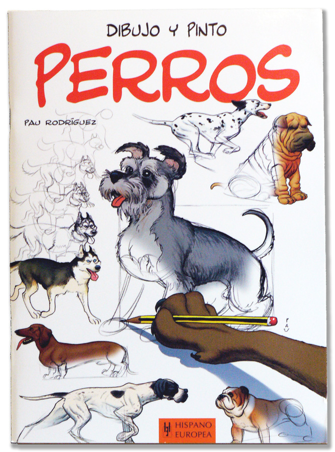
Dibujo y pinto PERROS.
Dibujo y pinto PERROS.:
 Ya está aquí la edición española de mi libro para aprender a dibujar perros, publicada por la Editorial Hispano Europea.

18 sept 2012
Squirrel Process
Squirrel Process: I had a couple people ask about my process recently, so here's a breakdown of how I paint (sometimes). My process is usually a lot messier than this, but these are the steps I jump around between:

 |
| I often start with a rough sketch. Adding color usually changes my feelings about the design so I like to keep things loose and change them as I go. I put the sketch on a multiply layer at low opacity before I start painting. |
 |
| I'll start most paintings with big flat colors. I usually start by filling in the background with a color that I wouldn't mind peeking out between the strokes (because that's what it's going to do). |
 |
| I usually paint in the background in that same step, but if I were more disciplined I'd paint it first behind the character. Here I used a Darken layer on top of the squirrel layer. |
 |
| At this point if I'm doing a tricky surface type like fur, I'll lay in where the major areas of texture and value will be. Here I also roughed in the acorn texture. |
 |
| Now is my first detail pass. Fingers, feet, and face get the most part of my attention. I'm careful to look for things like where the skin will show, around the eyes and in the nostrils (and in a small patch in the front of the muzzle). |
 |
| Now's my first pass for the lighting. Sometimes I'll block in lighting in the first stage, but like I said, fur is a tricky thing to paint and has to be built up in layers. I make sure that all planes facing toward the light are lit so the smaller forms don't get too broken up. |
 |
| I noticed that squirrel fur is dark at the tips, so I added a soft fringe on the forms that are turning away from us. For most of this painting I used one of two brushes---the Captured Bristle Acrylic from Painter and a modified version of that brush where I put some spacing between the bristles and turned down the "Spacing" attribute on the brush dabs so it gives a more continuous stroke. This second one I used for most of the fur. |
 |
| I wanted the eyes to look very glossy, so I put in an imaginary environment for the reflections. Sometimes reflections have colors that aren't elsewhere in the image so I took the chance to put in a little blue to make the eyes pop. I'm pretty sure the key light reflection is in the wrong spot, though most people won't notice. |
 |
| I still felt like the fur was too flat, so I put in a 50% layer of a dark black-red. |
 |
| At this point I put in the final touches: refining edges, catching textural details where important, etc. |
 |
| If I have a big area that I don't want to detail out, I'll use an overlay texture to break up the area and paint in a few details to maintain consistency. This can be hard to keep from looking cheap, but it's often worth the effort because it can save so much time. |
 |
| I have a habit of painting with less saturation and contrast than I really want, so I'll make a few adjustments before I call an image done. That's it; hope it's helpful to someone! |
4 sept 2012
Digital skin
Digital skin:


About black skin, I never find a good and single way. It's really depending on the color of the skin. As black skin is usually very reflective, the light has a big influence on the tones.


III/ Skin texture
I use the "dry brush" to do skin textures. It works pretty well if you use it carefully. Once again, try to work with very low opacity and on a separeted layer (so you could change the opacity of the layer too).
For the beauty spots and the freckles, I use the soft round brush ... A very small one. Working on a high resolution picture, it's easier ... It's not very long and you don't have to be very precise.


I think I have to speak about skin because I had a lot of questions about this.
Here's a list of tricks to do paint more "realistic" skin with your computer ...
I/ Skin tones
Avoid simple gradients. You cannot obtain convincing skin if you only add black and white to a basic skin tone. It's more complex than that.
Of course, all skins are different but you can try this :
- A little bit of olive green on the shadow.
- A little bit of blue under the eyes (lower lids).
- A little bit of red on the cheek bones.
Just work with low opacity (0 - 5%), on a separeted layer and with the soft round brush.
By the way, if the contrast is not good, it will not work. Contrast is more important than color.
Just work with low opacity (0 - 5%), on a separeted layer and with the soft round brush.
By the way, if the contrast is not good, it will not work. Contrast is more important than color.


About black skin, I never find a good and single way. It's really depending on the color of the skin. As black skin is usually very reflective, the light has a big influence on the tones.

II/ Influence of lights
Don't forget the ambient and the direct lights could changed your basic skin tones. With a strong light, shadows are very dark and the contrast of your picture has to be high, for example.
The color of the light is important too. Your palette depends on it too.
You can easily adjust the contrast/the tones/the luminosity of some parts of your picture with your favourite software. It's not the better way to work but it could sometimes be helpful.
Don't forget the ambient and the direct lights could changed your basic skin tones. With a strong light, shadows are very dark and the contrast of your picture has to be high, for example.
The color of the light is important too. Your palette depends on it too.
You can easily adjust the contrast/the tones/the luminosity of some parts of your picture with your favourite software. It's not the better way to work but it could sometimes be helpful.


III/ Skin texture
I use the "dry brush" to do skin textures. It works pretty well if you use it carefully. Once again, try to work with very low opacity and on a separeted layer (so you could change the opacity of the layer too).
For the beauty spots and the freckles, I use the soft round brush ... A very small one. Working on a high resolution picture, it's easier ... It's not very long and you don't have to be very precise.


Suscribirse a:
Entradas (Atom)