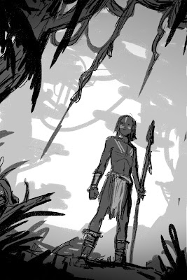
-By Dan dos Santos
In this post, I'd like to demonstrate my process for sketching concepts for a client. I'm not talking about sketching with the intent of making a beautiful drawing, where line weight and texture matter. Nor am I talking about making a realistic one. I'm talking about sketching very rough concepts that quickly convey your idea to a client. In essence, these are just elaborate thumbnails.
It seems to me that a lot of students have trouble sketching thumbnails. They either don't spend enough time on them, or often times skip the phase entirely. The result is, they spend even more time repeatedly revising a painting that was flawed from the start, when a much better option was just a few scribblings away. Part of me suspects they either don't realize the importance of this phase, or avoid it because they simply do not know how to approach it.
Sketching thumbnails should be fun, and easy. There are as many approaches to doing it as there are artists. My method is just one of them, and by no means the best solution. I'm sharing an approach that works for me, in the hopes that it will demystify the process for some of you.
I used to do all of my sketching in pencil, but found that I drew too linearly when I did so, almost comicbook-like. For some styles, that's fine. But because I paint realistically, and there are no actual 'lines' in my finished works, I found it to be an ineffective method. Things that looked really good in my sketch fell flat in the final because they did not have the strong impact of a line holding it all together.
Instead, I now do all my sketching digitally. This allows me to 'paint' my sketches. Amorphous blobs of grey gradually come together to reveal forms and space. This translates a LOT easier to my painting style.
The choice to sketch digitally is personal preference due to my own habits. You may not have the same problems with pencil that I do, and may find better success drawing traditionally. That's fine. The medium here is absolutely irrelevant. It's the approach that matters.
In an earlier post, I talked about Value Structure, and how by simplifying your composition into 3 or 4 basic values helps increase legibility, and creates a more believable sense of depth. This method is not something you just implement at the end of painting. It is, in fact, how I start all of my compositions.
Let's begin by taking 4 simple values... white, near white, near black, and black. By eliminating a true midtone, I force myself to make everything in my composition either light or shadow. This makes for stronger, more striking compositions.
I am going to start with the white of the canvas, and gradually build upon that.
Let's add in some near whites. This part is very experimental, just reckless scribbling, until I find something appealing.
Now onto the near blacks. Again, this is just stream of consciousness scribbling until I stumble across something nice.
Already you can see that the sketch has depth and a strong silhouette. In just 30 seconds, and only three values, I managed to create a fairly legible composition. Let's keep going and add some blacks.
At this point, you can stop.
Seriously, that's it.
This is as detailed as your thumbnails ever need to be. After this, everything else is just embellishment. If your composition isn't working at this point, all the details in the world aren't going to make it any better. If your composition isn't good enough for you, do another.. and another... and another! You can easily bang out 20 of these in an hour, and I encourage you to do so.
Thumbnails... easy-peasy, right?
So what happens if you do like the thumbnail? Sketching always seems to be some personal form of hieroglyphs for me, and even though I may understand what's going on, someone else may not. So if I decide to submit this composition to a client, I need to refine it a bit further still.
Let's start by scribbling in some details, so people can tell what all this junk actually is.
Since I started the composition with such a strong value structure, I can easily add gradients and details on top of that, without fear of losing the impact of the piece. This strong value structure will also prevail if I decide to add color to my sketch.
Remember that previous post about Temperature Structure? Well, let's implement it! The idea is no different than value structure. Let's place some warm, near warm, near cool, and cool tones on top of this sketch. The values are still doing all the work, but the temperature shift just pushes their effect even further.
Let's add a few more details, some highlights to snaz it up... and viola!
It's still pretty sloppy, but honestly this is usually about as detailed as my finished sketches get. I tend to submit 3 or 4 sketches like this for my clients to choose from. If I really want to impress them, I may go in and refine things a bit a further, but it's really not necessary. A good Art Director knows what to expect from his/her Illustrator, and should be able to envision what the finish product will look like.
So that's it.
The next time you're working on a new composition, challenge yourself to do as many rough sketches as possible, at least 20. And remember to be fearless! There is no need to refine and be precious about every little step. In the time you spend fussing with one bad thumbnail, you could have done 3 more!
I tend to think of it like panning for gold. You have to sift through a whole lot of crap before you find that one sparkling nugget that makes it all worth it!


